#correlation coefficient
Explore tagged Tumblr posts
Visit Tumblr Blog
Explore Tumblr blogs with no restrictions, modern design and the best experience.
Last Seen Tumblr Blogs


Fun Fact
Average visit duration of Tumblr.com is 10 mins and 25 secs.
Text
Young people moving to rural areas: Now is the time! (Essay)

Moon and Sun Shellfish
During my lunch break, while working remotely, I was watching NHK. They were broadcasting a daily program called "Good Immigration!!" I knew about this program but had never paid much attention to it. However, on November 28, 2022, I seriously watched the broadcast on this day.
The protagonist of this day was a man who worked as a highly paid management consultant for a foreign company, but he had a strong passion for fish and fishing and moved to a fishing village with his family. However, this man did not have any ties to the fishing village. As a consultant, he carefully researched fishermen's catch volume and annual income at each fishing port in Japan and even referred to aerial photographs of the fishing port. This was because he considered the quality of the fishing port's seawall, the presence or absence of oil storage facilities, etc. Without a storage facility, it would be inconvenient to have to rely on tankers every time to secure fuel. I see.
After all these investigations, he chose Eguchi Fishing Port in Kagoshima Prefecture, like a paratrooper. It was quite a bold move for the whole family to move to a strange place suddenly. As for fishing, this man has been increasing his catch every year, but he applies the "correlation coefficient" in statistics to analyze the fish species and the catching method. This is also something he made use of his experience as a consultant.
And what blew me away was his proposal to the fishing association for "newly cultivated" shellfish. It was "Moon and Sun Shellfish"... a romantic name, and as you would expect, the shells are beautiful, with different colors on the front and back like the sun and the moon. They are also delicious to eat. He researched how far from the shore and at what depth the young shellfish of this shellfish can be collected, and got some results. The broadcast ended with him talking about starting a business with the fishing association this. Yes, he is a reliable young man. He is not passive but is actively influencing the situation. I look forward to seeing what happens next for him.
#Young people moving to rural areas#rural areas#essay#rei morishita#Moon and Sun Shellfish#management consultant for a foreign company#fishing#correlation coefficient#actively influencing the situation
8 notes
·
View notes
Text
Correlation Coefficient: Ghid Complet pentru Evaluarea Relației Între Active
Correlation Coefficient: Ghid Complet pentru Evaluarea Relației Între Active Introducere Correlation Coefficient (coeficientul de corelație) este un indicator tehnic valoros care măsoară relația dintre două active financiare. Acesta ajută traderii să înțeleagă cât de mult se mișcă aceste active împreună sau în direcții opuse, oferind informații esențiale pentru diversificarea portofoliului și…
#analiza tehnica#strategie de tranzacționare#semnale de tranzacționare#diversificare portofoliu#Correlation Coefficient#coeficient de corelație#relație active
0 notes
Text
Per-Capita Income and Life Expectancy : W3 Data Analysis Tools
For the third week’s assignment of Data Analysis Tool on Coursera, we would continue to be working with GapMinder's dataset which contains statistics in the social, economic, and environmental development variable at local, national, and global levels
We would be studying the effect of Income per Person of a County on prevalent rates of life-expectancy. Since both the explanatory variable (Per-Capita Income) and the response variable are quantitative we'll calculate the Pearson Correlation Coefficient to analyze the strength of correlation between the variables.
The Correlation Analysis between the two variables gives :

The Correlation Coefficient is 0.60 with a very low p-value << 0.0001, which indicates a considerably strong and significant relation between the Per-Capita Income and the Life Expectancy of individuals. A positive Correlation Coefficient indicates that the Life-Expectancy increases with the Per-Capita Income of a Country.

However, looking at the scatter-plot between the two variables, we see that a sharp increase in the life expectancy is seen only at the very low end of the per-capita income spectrum. Beyond a per-capita income of 10000, the life-expectancy almost flattens out. So, we need to understand the strong relationship between the variables together the scatter-plot.
0 notes
Link
1 note
·
View note
Photo
Okay, breaking down what these mean and how to interpret them. Long post and I break down what each average is, the calculation of it, and what the other averages show for that comic.
Not using a readmore because it can fuck with accessibility, but hit "j" on desktop to skip this.
My stats background is only basic, so please correct me if any of the below is wrong. Happy to try and answer questions.
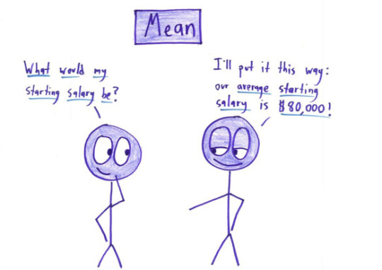
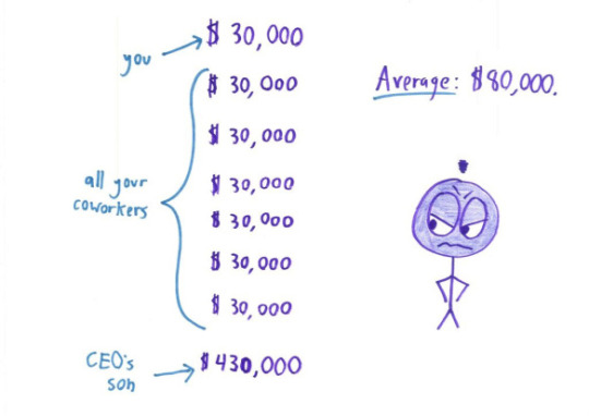
Comic 1 is about the mean average, the one you're likely most familiar with: Sum up all the values and divide by the number.
There are 7 lots of $30k and one lot of $430k so the sum is (7*30) + 430 = 210 + 430 = 640. And we then divide that by 8 lots to get $80k as the mean.
The mean provides an average, but can be easily skewed by outliers as we can see, and may not represent the distribution well!
The median here would be $30k, the mode would be $30k, and the range would be $400k. Mode is a sensible average here because you care about the most common case - that's probably the bucket you'd fall into and it's robust against outliers. The range is also useful since it'll tell you about how much disparity there is.
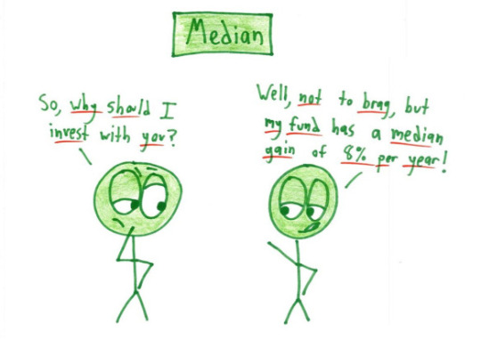
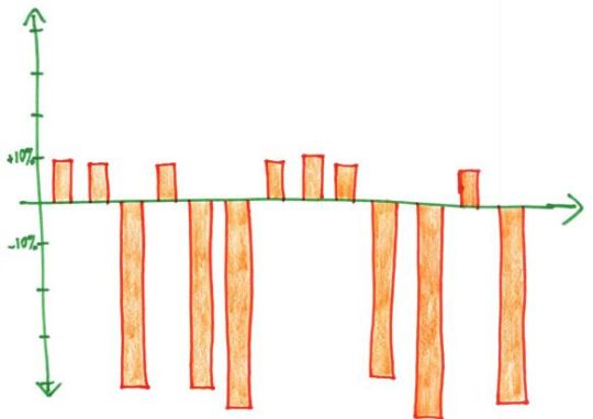
Comic 2 is about the Median average which means you order all of the values and take the middle one (or, if there's an even number of values and thus no middle, the mean of the two middle values).
If we order these values, we get something like six "-40"s followed by seven "8"s. So 13 values, the 7th one is the middle one. And the seventh is... an 8! So 8 is the median.
The median can be robust against outliers (if we have a value of -10k instead of -40 in there, no change), but doesn't tell you about the actual distribution as such.
The mean here would be -14%, the mode would be 8%, and the range would be 48%. The range is useful here to show you how swingy it can be, and the mean is useful for telling you the average over all the values but can still be misleading (since there can be positives).
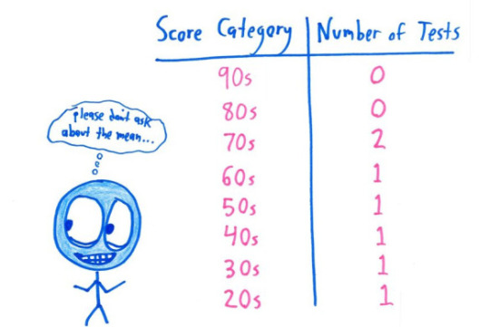
Comic 3 is about the mode - the mode says "Whatever value is the most common is the average".
So since we have the most tests in the "70-80" bucket, even though that's a very small proportion of the total (2 / 9 = 22% roughly), it's the most common bucket so we say the average is 70-80.
The mean would be (giving each bucket its min value) 340 / 7 = 48.6, the median would be the fourth value so the 50-60 bucket, and the range would be (considering both bounds of each bucket) 79-20 = 59. This tells us that the grades are highly variable, and the distribution is largely flat.
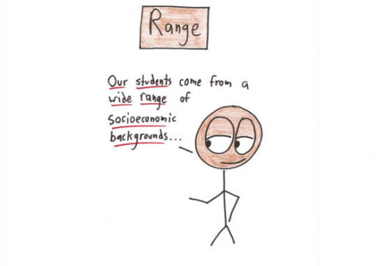
Comic 4 is about the range. The range is the difference between the highest and lowest values - min subtracted from max. If we assume each bar is an increment of $1000 and they start at $1000, then they go from $1000 to $10k and the range is 10-1 = 9k.
The mean would be somewhere on the high end (because that's where the values are clustered), as would the median and the mode. The range is misleading here because it doesn't consider frequency or distribution beyond "min" and "max", and is thus very sensitive to outliers. All of these other measures correctly tell us that most of the students are high-income.
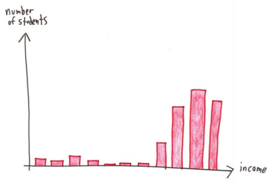
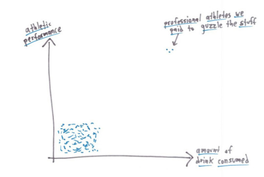
Comic 5 is about the correlation coefficient, which tells us "How correlated are these two variables?"
Correlation means that as one increases, the other will increase or decrease too - there's a relationship there.
Hot days and ice cream sales tend to be positively correlated, for instance, because as the average temperature goes up more people want ice cream. Hot days and hot chocolate sales are negatively correlated for much the same reason.
Since the correlation is simply a straight trend line that tries to fit the datapoints. If we draw a line like that here, it'll go from roughly the bottom left corner to the top-right corner through the middle of the cloud, right? That's how to best fit the points.
And because that means that as one increases, so does the other (at every point on the line where X is low, Y is low too and same for being high), it's positively correlated.
The mean athletic performance and amount consumed would both be potentially skewed by the outliers (we can't say without data values), the median would be very low for both, the mode would be very low for both, and the range would be very high.
The mode and range are both good identifiers here that the study is flawed: Most of the subjects do not fit the conclusion they're trying to push.
It's also worth noting that "highly correlated" doesn't mean positive or negative, just a strong correlation in one of those directions! You could say the same thing honestly (and misleadingly) if you flipped the graph vertically such that drinking it screwed up your performance.

The thing with statistics - via
278K notes
·
View notes
Text
Generating and Interpreting Correlation Coefficient
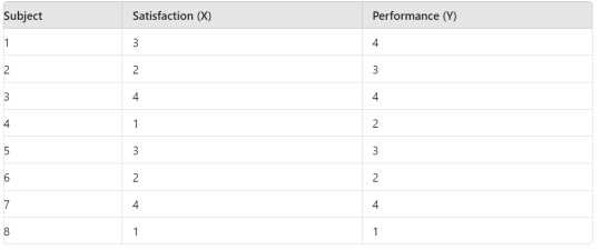
In this blog entry, I'll demonstrate how to generate and interpret a correlation coefficient between two ordered categorical variables. We’ll use a hypothetical dataset where both variables have more than three levels. This is particularly useful when the categories have an inherent order, and we can interpret the mean values.
Hypothetical Data
Assume we have two ordered categorical variables:
Variable X: Levels are 1, 2, 3, 4 (e.g., Satisfaction level from 1 to 4)
Variable Y: Levels are 1, 2, 3, 4 (e.g., Performance rating from 1 to 4)
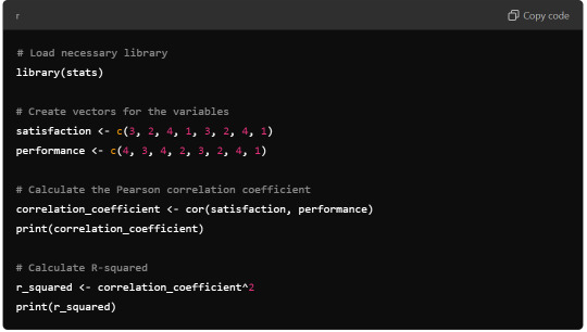
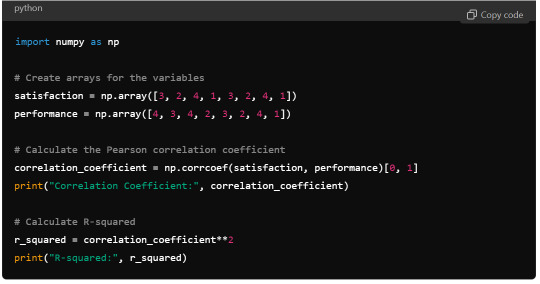
Here is a sample dataset:
Syntax for Generating Correlation Coefficient
R Syntax:
Python Syntax (using numpy):
Output
R Output:

Python Output:

Interpretation
The Pearson correlation coefficient between Satisfaction (X) and Performance (Y) is approximately 0.83. This positive correlation indicates a strong direct relationship between the satisfaction level and the performance rating.
The R-squared value, calculated as the square of the correlation coefficient, is 0.6889. This means that approximately 68.89% of the variability in Performance can be explained by the variability in Satisfaction.
Summary
Correlation Coefficient: 0.83, indicating a strong positive correlation.
R-squared: 0.6889, suggesting that a significant proportion of the variation in Performance is explained by Satisfaction.
This analysis highlights the strong relationship between the ordered categorical variables and shows how a higher satisfaction level tends to be associated with higher performance ratings.
0 notes
Note
Is the high level of inbreeding in dobes more because "undesirable" traits are common so those dogs get weeded out (whether actual bad things or just not fitting the breed spec), a small number of breeders having the monopoly, or because they are all related anyway so there's no way of avoiding it without an outcross program? Is something like the Doberman Preservation Project a realistic future for the breed?
The doberman breed is in the current shape its in due to multiple genetic bottlenecks- some simple stupid breeding decisions and others due to active war zones and the consequences of wars- paired with people who are stubbornly refusing to even try to make it better because they have convinced themselves that what they're doing is right.
Fenris is my lowest COI dobe to date [23% iirc] and while not the lowest I've seen in the breed [19%], still a huge improvement over to 50-60% breed average. But people have argued again and again that lowering COI means making breeding decisions that produce inferior dogs, and so many refuse to even consider it as a possibility.
(For non-dog people, COI is coefficient of inbreeding, and it is a look at the numbers behind how inbred a population is. You want as low of a number as possible. 25% is equal to immediate siblings. Ideally we'd want single digit numbers, with anything over 10% being a major problem to fix. To compare, my chihuahuas are something like 6% (Fae) and 0.02% (Tater). Sushi is a direct line breeding aunt-to-nephew so she's up in the 40s.)
(It doesn't necessarily mean a dog is immune to genetic predisposition to bad health, as evidenced by Tater's CM diagnosis, however it does seem to correlate directly with longevity and likelihood of developing these problems, meaning Tater unfortunately just lost the genetic lottery)
In other words, it is certainly possible to reduce the COI of the breed by HALF with smart breeding decisions, and people are plugging their ears going LA LA LA LA I CAN'T HEAR YOU because it means actually going out and looking past the popular sires and taking a chance on a dog that might not be your exact type but will still improve the next generation. This is not just a show line problem because I spend the majority of my time with working line dobes and working dobe people and this is an incredibly annoying problem there too. Fenris himself has popular sires in his pedigree, both the show half and the working half, so it is demonstratably very difficult to avoid.
I do think a well executed outcross project is needed, however... the problem I have is that the current proposed projects all suck. There's not a lot of direction outside of throwing things into the pot and seeing what sticks, and a lot of the resulting dogs quite frankly aren't what doberman people would be looking for anyway. Farm collies? Bulldogs? Bullies? Carolina dogs? Border collies? Pyrs? Why??? None of these are going to make a dog that has the temperament that draws people to this breed.
There are. A bunch of breeders who are waiting for an outcross project that actually makes sense. They've even posted in various outcrops groups that they would support a project if it had certain specifications. Many have said, get yourself a nice female and title her out in a bite sport and do all the doberman health testing even if she's not a doberman and we'd be interested in contributing semen. The response almost invariably has been "but I don't want a protective dog". Then what are you doing in a DOBERMAN project??? So of course the chief complaint is that most of these projects are not looking to make dobermans, they're looking to make their own breed and just have a doberman paint job. Well, sorry, but most involved doberman people want a DOBERMAN, not just a dog that looks like one. This is the only AKC recognized breed with the sole function of personal protection. They are protective dogs. Either accept that, or get interested in a different breed.
I have heard increasingly concerning things regarding the temperament of the doberman diversity project dogs, which does not surprise me unfortunately as none of these dogs are in any way sourced from dogs with verifiable correct temperament. What do you get when you cross a Craigslist Corso with a Craigslist doberman? Well the first generation might be okay for people who want pets but apparently the ones that have worked in protection are awful at it. Same with the malinois crosses- of course, you took a lukewarm malinois and bred it to a z-list doberman and you're surprised that you got a bunch of lukewarm at best pet dogs.
I think the only project I solidly am somewhat interested in is the bandog cross, and that cross works just fine but then of course it does because in that country, bandogs are exclusively military, police, and security dogs, and she bred it to a igp3 doberman. Unfortunately the doberman died before his 10th birthday, so now we're all waiting to see what happens with his progeny.
243 notes
·
View notes
Text
Why a Spinoff for Tarlos Is Feasible,Based on AO3 Data.

In this article,I will explain why the decline in Tarlos'popularity is an illusion and why Tarlos'popularity is rebounding and has a solid and reliable core audience in the long term.
It is well-known in American TV shows that the popularity of a ship is reflected in the annual increase of AO3 tags.The popularity of a ship is associated with many factors,such as the director's skills,the scriptwriter's plot design,and the chemistry between actors.
When the director,scriptwriter,and production team remain the same across seasons of the same TV show,these factors may fluctuate but the changes are relatively small.In such cases,people often overlook a key factor affecting the annual increase of AO3 tags:the number of episodes aired in a season!


(Top 100 in 2021,2022 and 2023)
For example,in 2023,compared to 2024,the annual increase of AO3 tags for"TK/Carlos"declined and exited the top 100 for the first time since 2021.Does this mean Tarlos is no longer popular?On the contrary,the conclusion is incorrect because it ignores the number of episodes aired each season.
9-1-1:Lone Star from 2020 to 2023,each year saw a complete season aired,while only nine episodes were broadcast in Season 5 in 2024.

According to the Pearson correlation coefficient formula,the annual increase of tags is strongly positively correlated with the total number of episodes per year(referred to as"episodes").

The correlation coefficient : r≈ 0.645
In statistics,when 0.7≤|r|≤ 1,two factors are considered to have a strong correlation.However,from Seasons 1 to 4,there were fluctuations in production quality.Season 4 had the lowest ratings on various review websites compared to the previous three seasons.Did this fundamental factor affect the tag increase in 2023?
To test this hypothesis,we removed the data from Season 4 and recalculated the Pearson correlation coefficient using data from Seasons 1,2,3,and 5.

The new correlation coefficient:r'≈ 0.845
We then conducted a hypothesis test to verify the p-value:(0.05<p<0.1),which means the correctness rate of the correlation is over 90%.
Thus,under similar production standards,the number of episodes in9-1-1:Lone Starand the annual increase of"Carlos/TK"AO3 tags have a very strong positive correlation.
We can conclude that the main reason for the drop of"TK/Carlos"out of the top 100 in 2024 was the reduced number of episodes aired that year.
Apart from statistical analysis,other factors also played a role:
1. Season 5 premiered at the end of September.By the cutoff date for the rankings(January 1,2025),only nine episodes had been aired.Many viewers hadn't had time to watch,and many fan fiction authors hadn't had time to write.
2. Previous seasons(Seasons 1-4)were broadcast at the beginning or middle of the year,finishing by September at the latest.They attracted viewers for most of the year.In contrast,Season 5 only had three months(from September to December)to attract viewers.
3. The gap between the premiere of Season 5 and the last episode of the previous season was as long as 13 months,longer than the gap between any other seasons.
4. Season 5 had the least official promotion,relying almost entirely on the actors'personal promotions.
In fact,Tarlos'popularity has not declined but increased.The reduced number of episodes in 2024 affected the data and led to a misjudgment.

Focusing on the last column:The Average Contribution per Episode to the Annual Increase in Tags.
In 2024,each of the nine episodes contributed an average of about 150 tags.Compared to last year's figure of 85.8,this represents a year-on-year growth rate of 74.83%.Looking at the past five years,the average contribution per episode this year is close to the historical high,almost comparable to the peak in 2021.
From this analysis,we can see that Tarlos'popularity has been steadily rising since the debut of9-1-1:Lone Starin 2020,reaching its peak in 2021,then entering a stable period,and finally hitting another peak in 2024.
Tarlos has the potential for sustainable growth.If a Spinoff featuring them were to air on streaming platforms or other good platforms,their stable audience and fan base would continue to contribute to the popularity and discussion of Tarlos.
Conclusion:Tarlos has a solid and reliable core audience with the potential for sustainable development and long-term success.
Given the relatively low cost and high return on investment for a derivative series,it is highly feasible.As long as the scriptwriting quality of the derivative series can maintain the level of the original,continued success is not only possible but likely—even more so than before.🔥


30 notes
·
View notes
Text
Comparing the intellectual level of each country (Essay)

@SI (stupid index) is the area of a country divided by the square of (coastline + border). Measures the approximate degree of intellectual level. The higher the number, the lower the intellectual level. Canada has a large area but is small because it has a long coastline, while the USA is large because it has many straight borders. Canada has a high intellectual level.
@The smaller the SI, the higher the intellectual level, but Indonesia has a lower UGR (university graduate ratio: Percentage of university graduates in the total population.). This also gives us a glimpse of its history as a colony.
@Russia has a surprisingly high intellectual level.
@India and China have large SI and low UGR. A small number of elites are controlling the ignorant majority of the people.
@The correlation coefficient is -0.402, with a slight correlation between the two indicators.
Appendix (SI)
It is assumed that the longer a country's borders are compared to its land area, the more sensitive it is to foreign enemies. I will review the concept a little, and since conflicts over territory and others often occur not only on the coastline but also on the borderline that connects to the land, I will mainly consider the borderline that includes it, as a matter of course. And since the land area is two-dimensional with km ^ 2, to make the dimension (unit) non-unit, divide the land area by the square of the borderline (km) and divide the value by the "stupid index" (SI).
Stupid index = (land area: km ^ 2) ÷ (total border line length: km) ^ 2
Just in Wikipedia, there is a list of total coastline lengths and land areas of each country in the world (list by the length of national coastline).
Again, large countries such as Russia, Canada, China, USA, Australia, Brazil Of course, the "stupid index: SI" is large.
However, it cannot be said that each nation's "political stupidity is known" from this index alone. Still, it seems to have a certain meaning when looking at the stupidity of Americans in the inland United States. In this year's US presidential election, many people supported Trump in the inland states in the center of the United States. It's obvious at a glance. Many white Americans who strongly supported Trump, who was a dirty politician, voted for Trump, and the states he acquired are also concentrated in the inland states in the center of the United States ... stupid dens.
By the way, the countries with large areas have large SI, Russia, the United States, China, and India have about 50 to 100, and Australia and Mexico have about 100. Canada, which has the second largest area in the world, has a coastline. Because it is long, the SI is relatively small. Brazil is unexpectedly large, with an SI of 159, which is by far the biggest. Conversely, if you look at countries with small SI, they are usually island countries, such as Indonesia, the Philippines, Japan, New Zealand, and the United Kingdom. But is it "wise"? Asian countries, including Japan, have rather large SI and are natural.
I think that the reason why a country with a small "stupid index: SI" like Japan is "stupid" is probably not a geographical factor but a geopolitical factor. In other words, I think the biggest factor is that after WW2, the United States continued to rule and the political sensibilities of not only politicians but the general public were paralyzed. This will be the same in other Asian island nations. In addition, the old letter "country" of the kanji "country" means to be confused (with suspicion) about what will happen at the borders on all sides. It is used to mean living sensitively to foreign enemies, and it is the origin of the fact that fools destroy the country.
各国の知的レベルの評価
@SIは、国の面積を(海岸線+国境線)の2乗で割ったもの。おおまかな智的レベルの程度を測定する。大きいほど知的レベルが低い。カナダは面積が広いが海岸線が長いので小さく、USAは直線的な国境線が多いので大きくなる。カナダは知的レベルが高い。
@SIが小さいほど、知的レベルは高いと予想されるが、インドネシアはUGRが低い。これには植民地として支配された歴史も垣間見える。
@ロシアはあんがい知的レベルが高い。
@インド、中国はSIが大きく、UGRが低い。蒙昧な大多数の国民をわずかな数のエリートが指嗾している。
@相関係数は「―0.402」、2つの指標の間には、やや相関が見られる。
#intellectual level#essay#rei morishita#SI#stupid index#UGR#university graduate ratio#correlation coefficient
1 note
·
View note
Text
Patients With Long-COVID Show Abnormal Lung Perfusion Despite Normal CT Scans - Published Sept 12, 2024
VIENNA — Some patients who had mild COVID-19 infection during the first wave of the pandemic and continued to experience postinfection symptoms for at least 12 months after infection present abnormal perfusion despite showing normal CT scans. Researchers at the European Respiratory Society (ERS) 2024 International Congress called for more research to be done in this space to understand the underlying mechanism of the abnormalities observed and to find possible treatment options for this cohort of patients.
Laura Price, MD, PhD, a consultant respiratory physician at Royal Brompton Hospital and an honorary clinical senior lecturer at Imperial College London, London, told Medscape Medical News that this cohort of patients shows symptoms that seem to correlate with a pulmonary microangiopathy phenotype.
"Our clinics in the UK and around the world are full of people with long-COVID, persisting breathlessness, and fatigue. But it has been hard for people to put the finger on why patients experience these symptoms still," Timothy Hinks, associate professor and Wellcome Trust Career Development fellow at the Nuffield Department of Medicine, NIHR Oxford Biomedical Research Centre senior research fellow, and honorary consultant at Oxford Special Airway Service at Oxford University Hospitals, England, who was not involved in the study, told Medscape Medical News.
The Study Researchers at Imperial College London recruited 41 patients who experienced persistent post-COVID-19 infection symptoms, such as breathlessness and fatigue, but normal CT scans after a mild COVID-19 infection that did not require hospitalization. Those with pulmonary emboli or interstitial lung disease were excluded. The cohort was predominantly female (87.8%) and nonsmokers (85%), with a mean age of 44.7 years. They were assessed over 1 year after the initial infection.
Exercise intolerance was the predominant symptom, affecting 95.1% of the group. A significant proportion (46.3%) presented with myopericarditis, while a smaller subset (n = 5) exhibited dysautonomia. Echocardiography did not reveal pulmonary hypertension. Laboratory findings showed elevated angiotensin-converting enzyme and antiphospholipid antibodies. "These patients are young, female, nonsmokers, and previously healthy. This is not what you would expect to see," Price said. Baseline pulmonary function tests showed preserved spirometry with forced expiratory volume in 1 second and forced vital capacity above 100% predicted. However, diffusion capacity was impaired, with a mean diffusing capacity of the lungs for carbon monoxide (DLCO) of 74.7%. The carbon monoxide transfer coefficient (KCO) and alveolar volume were also mildly reduced. Oxygen saturation was within normal limits.
These abnormalities were through advanced imaging techniques like dual-energy CT scans and ventilation-perfusion scans. These tests revealed a non-segmental and "patchy" perfusion abnormality in the upper lungs, suggesting that the problem was vascular, Price explained.
Cardiopulmonary exercise testing revealed further abnormalities in 41% of patients. Peak oxygen uptake was slightly reduced, and a significant proportion of patients showed elevated alveolar-arterial gradient and dead space ventilation during peak exercise, suggesting a ventilation-perfusion mismatch.
Over time, there was a statistically significant improvement in DLCO, from 70.4% to 74.4%, suggesting some degree of recovery in lung function. However, DLCO values did not return to normal. The KCO also improved from 71.9% to 74.4%, though this change did not reach statistical significance. Most patients (n = 26) were treated with apixaban, potentially contributing to the observed improvement in gas transfer parameters, Price said.
The researchers identified a distinct phenotype of patients with persistent post-COVID-19 infection symptoms characterized by abnormal lung perfusion and reduced gas diffusion capacity, even when CT scans appear normal. Price explains that this pulmonary microangiopathy may explain the persistent symptoms. However, questions remain about the underlying mechanisms, potential treatments, and long-term outcomes for this patient population.
Causes and Treatments Remain a Mystery Previous studies have suggested that COVID-19 causes endothelial dysfunction, which could affect the small blood vessels in the lungs. Other viral infections, such as HIV, have also been shown to cause endothelial dysfunction. However, researchers don't fully understand how this process plays out in patients with COVID-19.
"It is possible these patients have had inflammation insults that have damaged the pulmonary vascular endothelium, which predisposes them to either clotting at a microscopic level or ongoing inflammation," said Hinks.
Some patients (10 out of 41) in the cohort studied by the Imperial College London's researchers presented with Raynaud syndrome, which might suggest a physiological link, Hinks explains. "Raynaud's is a condition of vascular control or dysregulation, and potentially, there could be a common factor contributing to both breathlessness and Raynaud's."
He said there is an encouraging signal that these patients improve over time, but their recovery might be more complex and lengthy than for other patients. "This cohort will gradually get better. But it raises questions and gives a point that there is a true physiological deficit in some people with long-COVID."
Price encouraged physicians to look beyond conventional diagnostic tools when visiting a patient whose CT scan looks normal yet experiences fatigue and breathlessness. Not knowing what causes the abnormalities observed in this group of patients makes treatment extremely challenging. "We need more research to understand the treatment implications and long-term impact of these pulmonary vascular abnormalities in patients with long-COVID," Price concluded.
#long covid#covid#covid news#mask up#pandemic#covid 19#wear a mask#public health#sars cov 2#still coviding#coronavirus#wear a respirator#covid conscious#covid is airborne#covid isn't over#covid pandemic#covid19#covidー19
99 notes
·
View notes
Text
Day 21/100 days of productivity

So much left to do, so little time 😬
• finished the police investigations unit
• learned more about the correlation coefficient and the p-value in statistics
Just one more unit to finish before the Christmas holidays in three days!
Hope everyone’s excited for a break! x
#studyblr#study blog#study motivation#studyspo#study aesthetic#study inspiration#study notes#studystudystudy#student#academic
22 notes
·
View notes
Text
i spent an embarrassingly long time in high school really confused how the correlation coefficient could possibly be symmetric and the slope of the line of best fit. like actual months of this gaping hole in my understanding. just goes to show you that geometry will lie to you and you need to blindly trust algebra instead
14 notes
·
View notes
Text
i dunno i wanted to make some graphs
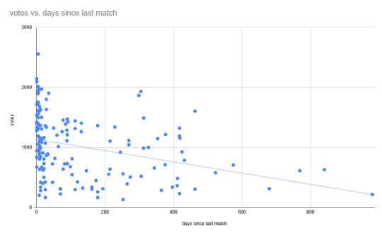
Lemme give a basic lesson in coefficient of determination
Denoted by R2, it's a number that measures how well a statistical model predicts an outcome. If it's 0, there's no correlation. If it's 1, it's a perfect correlation. Most results in real-world examples will be somewhere in between. For instance, the graph above the cut shows the data of the number of votes a wrestler has and how many days it has been since their last televised AEW match (excluding Mr. Brodie Lee because he's what's known as an outlier). Below, I've separated the data into the men's and women's division (left and right respectively) and included the trendline and R2

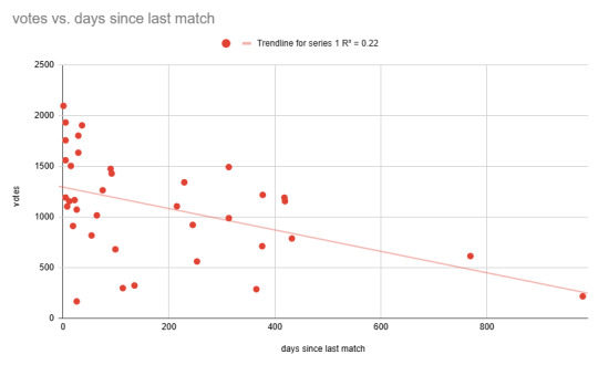
Now what you'll notice is that the men's R2 value is 0.061 and the women's R2 value is 0.22. That means that although there isn't much of a correlation between days since their last match and number of votes they get, there does exist some amount of correlation. Not just that, the women's value is almost 4 times what the men's is.
(I cannot stress enough that there is not significant correlation. I just found that the fact there was any at all interesting)
While I was finding this data, I also noted that the average man in AEW had his last match 116 days ago while the average woman in AEW had her last match 180 days ago (once again not counting Brodie Lee).
Anyway if I find any kind of comparison that does offer a significant correlation I'll share it, but for the time being, out of all the things I've tested, I haven't found anything higher than R2=0.22
#most beloved aew wrestler tournament#aew#also only 35% of active women have held a belt compared to 44% of active men
9 notes
·
View notes
Text
writing a lab report and i feel so bad calling this correlation weak and insignificant. im kicking this phi coefficient in the dirt with my heel and spitting on it. Tch. Pathetic.
#வார்த்தைகள்#been working on this shit all day#i DID finish it though which means…my day basically starts now. at 7:30 pm. sigh such is life
8 notes
·
View notes
Text
I think I'm as ready as I can be for my presentation. I have the slides all ready, though I still don't quite understand what I'm saying and I haven't learnt anything by heart so I'll be talking from my slide notes. And I might struggle to answer questions if there will be questions because my notes are spread over three print outs of multiple pages. X3
Also, those who know statistics, please tell me if my stupid meme below the cut makes sense X3

(I can't actually confirm that it's lower. It's a correlation coefficient of r: -0.30. But since I also have graphs with means I can see that it's lower. I just don't know if the magic of R confirms my findings or I just did a test wrong somewhere *lol*)
40 notes
·
View notes
Text
Essay by Eric Worrall
Taking “model output is data” to the next level…
AI reveals hidden climate extremes in Europe ByAndrei Ionescu Earth.com staff writer … Traditionally, climate scientists have relied on statistical methods to interpret these datasets, but a recent breakthrough demonstrates the power of artificial intelligence (AI) to revolutionize this process. Previously unrecorded climate extremes A team led by Étienne Plésiat of the German Climate Computing Center in Hamburg, alongside colleagues from the UK and Spain, applied AI to reconstruct European climate extremes. The research not only confirmed known climate trends but also revealed previously unrecorded extreme events. … Using historical simulations from the CMIP6 archive (Coupled Model Intercomparison Project), the team trained CRAI to reconstruct past climate data. The experts validated their results using standard metrics such as root mean square error and Spearman’s rank-order correlation coefficient, which measure accuracy and association between variables. …
The only thing which is real about using generative AI to try to fill in the gaps is the hallucinations.
What are AI hallucinations? AI hallucination is a phenomenon wherein a large language model (LLM)—often a generative AI chatbot or computer vision tool—perceives patterns or objects that are nonexistent or imperceptible to human observers, creating outputs that are nonsensical or altogether inaccurate.
I am an AI enthusiast, I believe AI is contributing and will continue to contribute greatly to the advancement of mankind. But you have to rigorously test the output. Comparing the AI output to a flawed model to see if it fits in the band of plausibility is not what I call testing.
Climate scientists have been repeatedly criticised for treating their model output as data. Using a tool which is known for its tendency to produce false or misleading data, to generate climate “records” which cannot be properly checked in my opinion is an exercise in scientific fantasy – a complete waste of time and money.
6 notes
·
View notes